
- Home
-
Our Services


- Our Projects
- Target Market
- Insights
- Q&A
- 简体中文


What Is a Brand Kit?
A brand kit is a compilation of visual materials and assets for maintaining a consistent brand visual identity. Brand kits are essential and efficient tools that dictate style rules for color palettes, typography, logo designs, and other brand elements so that marketing materials are cohesive and recognizable to a target audience. These brand design kits are helpful for new hires and freelance designers who need to familiarize themselves quickly with a brand’s visual identity and rules.
What Is the Purpose of a Brand Kit?
A company’s brand kit provides its graphic designers with a short guide and the information needed to execute brand consistency. Brand identity kits unite the visual elements of a brand, making these kits essential for small businesses and large corporations. The brand elements within a kit will dictate the design and execution of social media posts, emails, business cards, website pages, and other traditional and digital marketing assets. Consistent branding can boost brand recognition, leading to more robust consumer engagement.
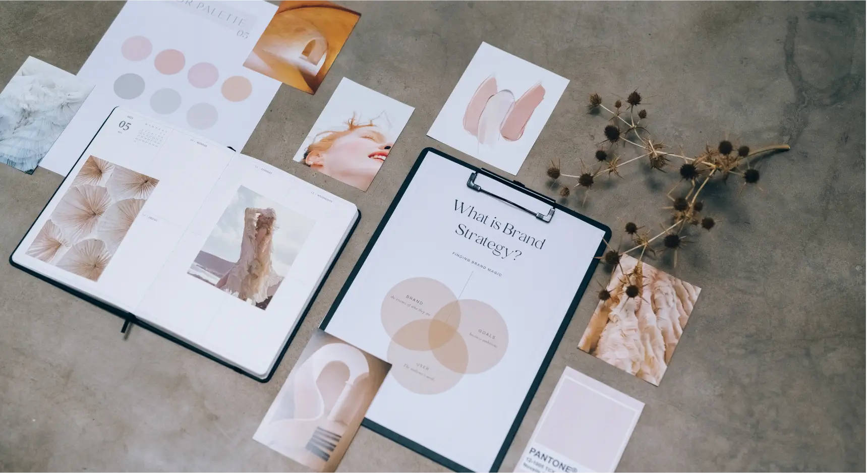
Elements of a Brand Kit
Brand kits will define the use of several design elements,
including:
1. Color scheme: It’s important for brand colors to remain
consistent. A brand kit’s color scheme includes the hex codes
designers use for a brand’s primary and secondary color
schemes.
2. Logo treatment: The company name may have various treatments
in different formats. Some formats might include the full name
of a business; others might shorten it to a single letter. Kits
show how you can communicate a brand message through simple,
memorable logo designs.
3. Photography: The kinds of photographs brands use—staged
portraits versus candid shots, black-and-white photos versus
color ones—will also be a part of these branding guides.
4. Templates: For visual consistency, your company’s brand guide
may also come with templates for email blasts, social posts, and
print materials to provide designers with a structure.
5. Typeface: Brand fonts are often custom fonts that designers
build to reflect the style and tone of a company. Drives for
downloading the typography design will often be in a brand kit,
along with how to treat the text’s spacing (known as kerning and
leading).
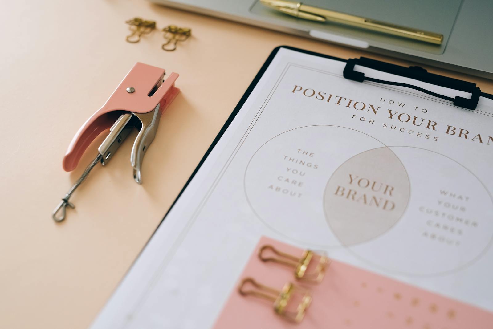
How to Create a Brand Kit?
A brand kit is a concise version of a more comprehensive brand
style guide, which outlines brand assets and design choices in
detail. Learn how to make your company’s rulebook through the
steps below:
1. Begin your guide with a brand story. Before diving into the
brand guidelines and rules, open your brand style guide with
your company’s mission statement with an accompanying image or
logo that connotes the values of your business. This information
will give the reader a firm foundation to understand your
business and give designers a strong sense of what all the
subsequent imagery should convey.
2. Discuss your brand voice. Written communication is generally
part of an editorial style guide, but sharing dos and don'ts of
how text behaves concerning images, photos, and ads will be
helpful for readers. Designers should understand the tone of
your brand voice, which will come through both visually and
verbally.
3. Highlight different logo iterations. Logos will have to fit
into ads tall and wide, square and round. Show your logo's
adaptability so designers can see its many iterations better.
Branding mogul Kris Jenner knows that designing a logo to fit a
brand's ethos is challenging. For her part, she creates a vision
board to brainstorm creative ideas. “Before social media and
before everything was splashed everywhere, you knew that your
logo was gonna go in print, on a billboard, maybe on television,
if you were really lucky,” Kris says. “And now, it's a much
different ballgame. So the images and the creative [elements]
and the exposure to all of that is so much greater—the stakes
are higher.”
4. Include your typography. The brand identity includes the
company’s font and spacing of letters and words. Articulate the
design choice behind your font and how to employ written content
in graphical contexts.
5. Share your brand’s color palette. Companies typically have a
primary logo color and secondary (and sometimes tertiary) colors
that operate as accents. Show swatches of colors that define the
look and feel of your brand. “When you start developing your
brand, one of the first things you think about is your logo and
the colors you're gonna use, what it's gonna feel like, and what
is gonna be your palette,” Kris says. “If you want to choose
pink, what color pink? There are a lot of decisions to be made,
and I really feel like they're very important decisions.”
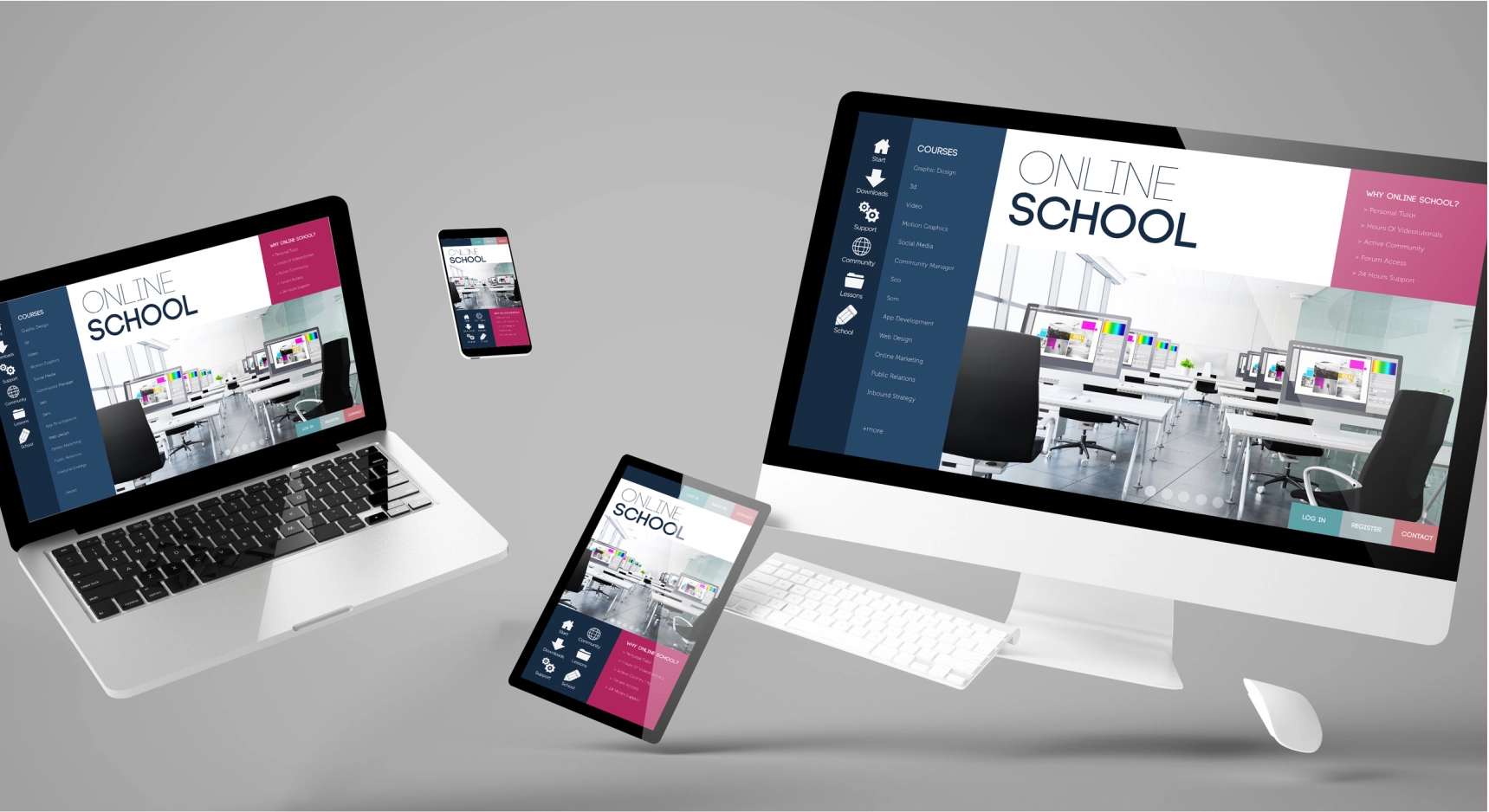
Digital posters comprise a digital image or motion graphic on a
screen. Digital signage is a dynamic and eye-catching way to
convey information or advertise a product or event.